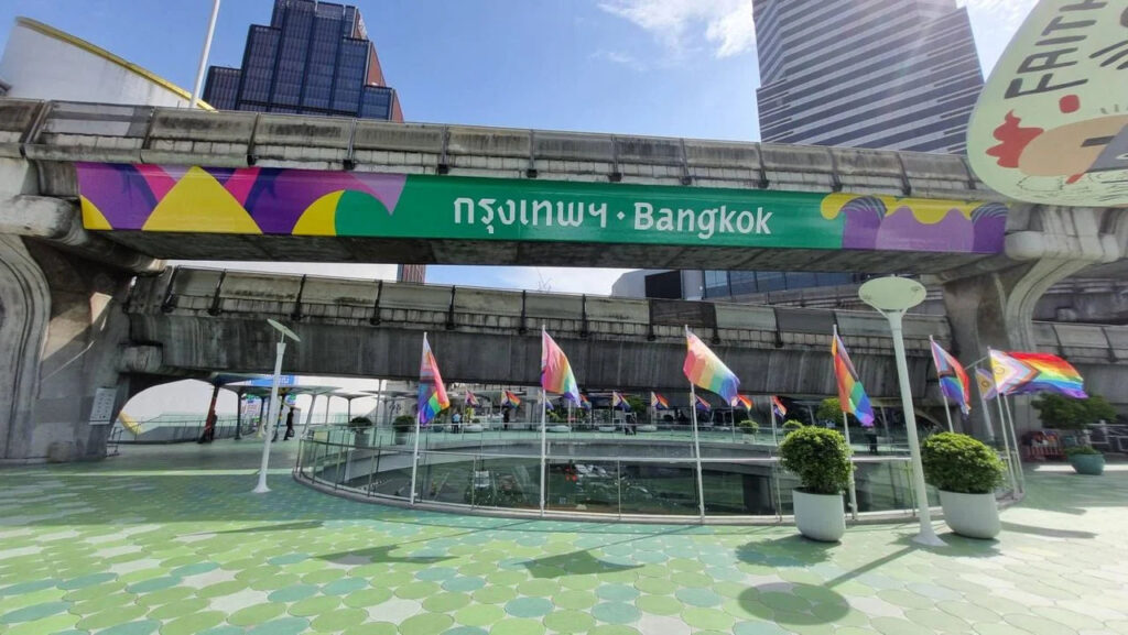
The new sign in Bangkok costs 3 million baht, and it might be more significant than it seems at first.
Right now, one of the most talked-about issues is the “Bangkok sign” on the BTS Pathumwan intersection. It’s bright and colorful, unlike the old faded sign, leading people to question its suitability and appearance.
People are also concerned about the high cost, wondering if it was worth spending 3 million baht on this new sign.

If we look at what Bangkok aims to achieve, we can see that this is part of a bigger plan to create a strong Corporate Identity (CI). This new sign uses a special font called “Sao Chingcha,” designed under Bangkok’s CI. The font is inspired by traditional Thai letters and the emblem of Indra riding Erawan.
Bangkok has been using this font in various promotional materials since the end of 2023. They also use an emerald green background, as specified in their CI guidelines. This careful design choice is meant to be consistent across different media.
For those interested, the Sao Chingcha font is available for free download at www.pr-bangkok.com.
Understanding Corporate Identity is essential. It’s not just about designing fonts or logos but setting the direction for how the organization communicates its identity over the next 3, 5, or even 10 years.
This thoughtfully designed CI acts as a “design bible” for Bangkok. Any future design work, whether from design companies or individual designers, must follow these CI guidelines.
CI is about communicating where the organization wants to go and what it wants to become.
Not everyone will agree on the style or look of the CI, which is natural. The real challenge for Bangkok will be how this CI shapes the city’s identity over the next five to ten years.
The value of this Corporate Identity will be measured by its long-term impact, and we will have to wait and see if spending 3 million baht was worth it for Bangkok’s new identity.